Customize the styles
This guide explains how to override a component in Front-Commerce, to customize the default styles
It is not something that you can do in just a few minutes because your identity shines in the details. However, you can do all the heavy lifting pretty quickly by customizing what is called Design Tokens.
And it's a great way to familiarize yourself with Front-Commerce!
If you already have your design tokens (typically a JSON exported from your
design system), copy the prompt below and paste it into your agent of choice
(Claude Code, Cursor, etc.). It will read your tokens, map them to the right
SCSS files, create the overrides under app/theme/..., and walk you through
typography and CSP setup if needed.
Get your Design Tokens
This concept is often closely related to Design Systems. Basically Design Tokens are the core styles of your design: colors, font families, font sizes, borders, shadows, etc. Together they are what make your brand unique.
There even exist tools that extract those tokens from existing websites. In this example, we will use CSS Stats to extract Design Tokens from Smashing Magazine and use them later.
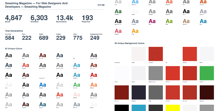
If you want to learn more about it, you can have a look at Design tokens for dummies which is a very nice introduction.
Apply these tokens to your theme
Now that we've got our Design Tokens, let's apply them to Front-Commerce's chocolatine theme.
Since we use the Atomic Design principles, the tokens are within atoms of our
theme. From your application, you will find components in the theme directory
and atoms under its theme/components/atoms subdirectory.
For example, files for
theme-chocolatine, will be
in
@front-commerce/theme-chocolatine/src/theme
The theme-chocolatine will be used as an example for this guide
In this guide, we'll focus on the colors and the typography settings. But feel free to go further and edit buttons, form inputs, etc.
Colors
In order to style our HTML, we use Sass, the well-known CSS preprocessor. Thus, the design tokens often translate to Sass variables.
For instance, if we want to edit the colors of our application, we need to override the one defined in the core. To do so:
Typography
We could change the fonts to match Smashing Magazine's in a similar way. Fonts
are defined in theme/components/atoms/Typography/_typography.scss. The
difference here is that we will also introduce a different font for headings and
that we will have to allow the remote font domain in the
CSP headers.
Follow the same steps than for colors:
Icons
To introduce new icons or
override existing
icons you can add an app-icons file including your icons, for example:
import { FcHome, FcPhone } from "react-icons/fc";
/** @type {Record<string, import("react-icons").IconType>} */
const componentIcons = {
  home: FcHome // this will override the `IoIosHome` icon from the core implementation
  phone: FcPhone // this will add a new icon
};
/** @type {string[]} */
const svgIcons = [];
export default {
  componentIcons,
  svgIcons,
};
A new look
Front-Commerce would then now look like this:
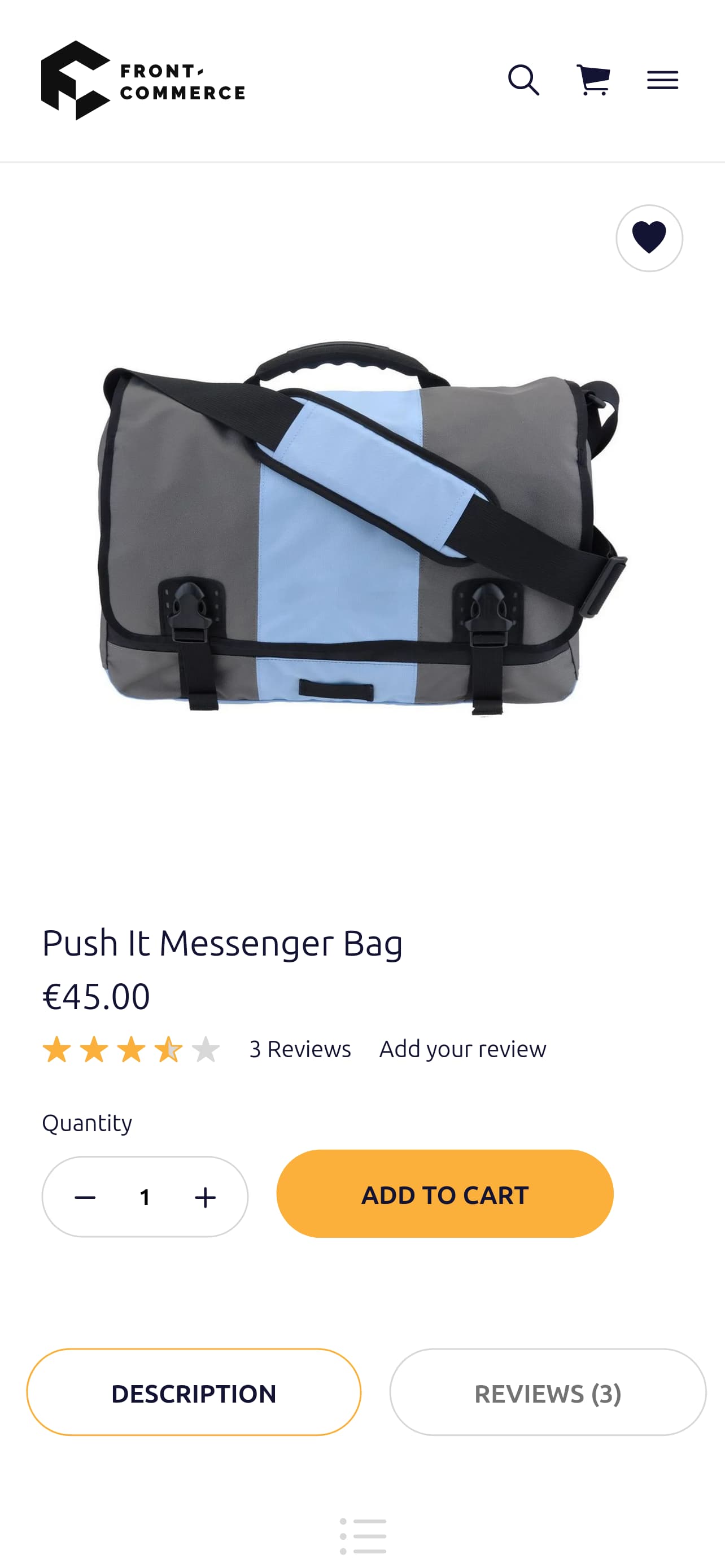
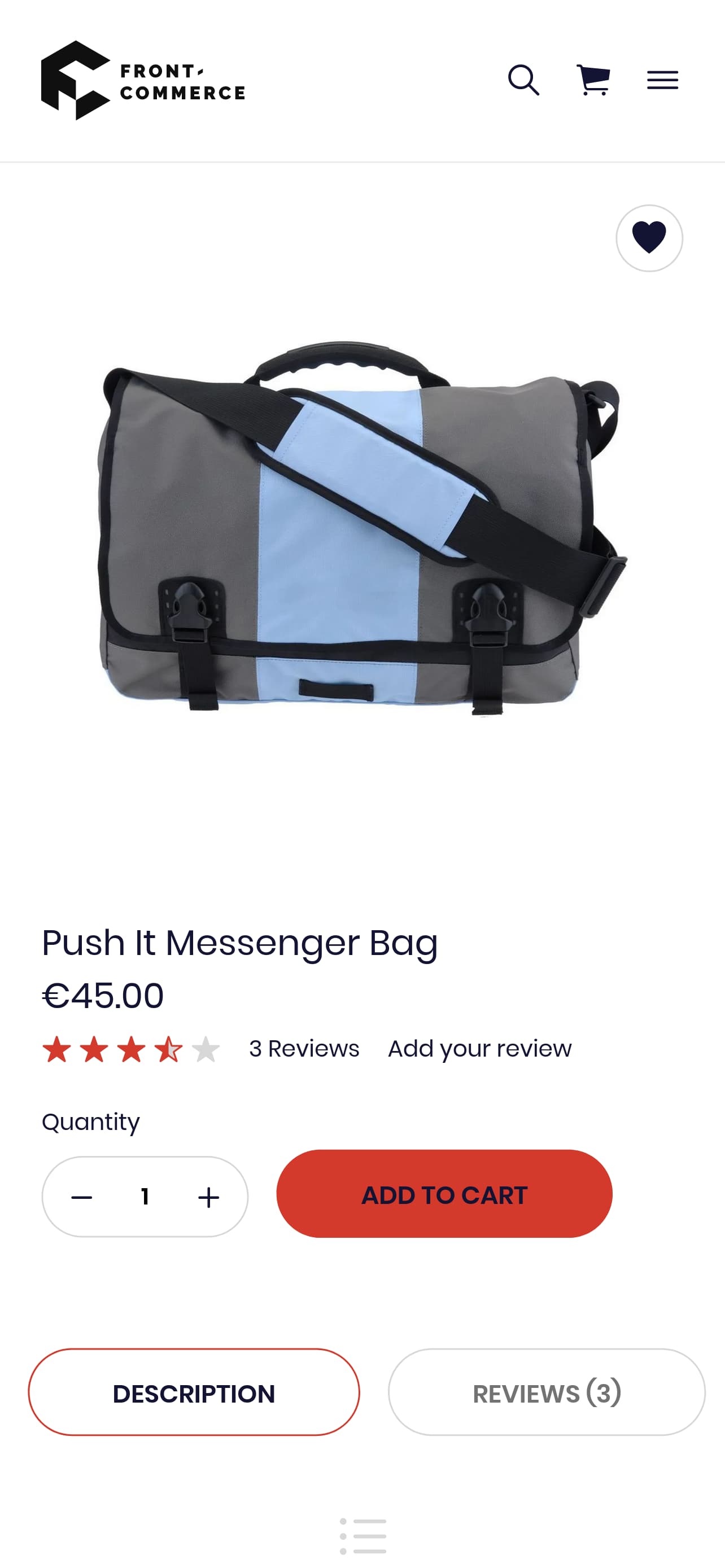
Sure it still needs tweaking, but as you can see, it is already far better. Furthermore, it is an easy first step to start convincing your team and clients that using modern front-end technologies is for the best.
You can experiment further by changing other tokens such as spacing, form inputs, buttons…
Expand your brand theme
Please note that all we've been talking about until now was to adapt the existing to your convenience. However, that is not the only benefit of having a Design System already in place. It is actually a perfect canvas to help you creating new components and styles matching to your brand.
See the override component guide to learn more about this.