Add a component to Storybook
Our goal with Front-Commerce is to give you the tools you need to develop a delightful user experience within your e-commerce shop. One of these tools is a Design System.
The concept lying behind a Design System is to document how your brand communicates with its users. This goes from global guides such as "Voice and tone", "Code Convention", "Accessibility"… to components documentation that focus on where and how to use a specific component.
Such a Design System should be customized to the way your team(s) work and should evolve according to your needs. But with Front-Commerce, we provide you a base you can iterate on.
Technically, we use Storybook which is a tool that
references stories for each component you want to document. With these
stories, it will launch for you a website that allows you to browse through your
components.
In this guide we will go through a basic tutorial that gets you started with writing stories within Front-Commerce. But if you want to learn more about Storybook, please refer to its documentation.
Add your own story
In order to add your own story, you need to create a new file, that will
document how to use a component and will reference each edge case for this
component. Each case will be what we call a story.
As explained in Storybook's documentation:
A story captures the rendered state of a UI component.
To do this, you will create a .stories.tsx file next to your component. In
this example, we will use the same component as in Create a UI Component:
IllustratedContent.tsx. Hence, your stories file will be
IllustratedContent.stories.tsx and will look like this:
import type { Meta, StoryObj } from "@storybook/react";
import IllustratedContent from "./IllustratedContent";
import Icon from "theme/components/atoms/Icon";
import { H3 } from "theme/components/atoms/Typography/Heading";

const meta: Meta<typeof IllustratedContent> = {
  component: IllustratedContent,
};

export default meta;

type Story = StoryObj<typeof IllustratedContent>;

export const Default: Story = {
  render: () => (
    <IllustratedContent media={<Icon title="calendar" icon="calendar-full" />}>
      <H3>Shipping within 48h</H3>
    </IllustratedContent>
  ),
};
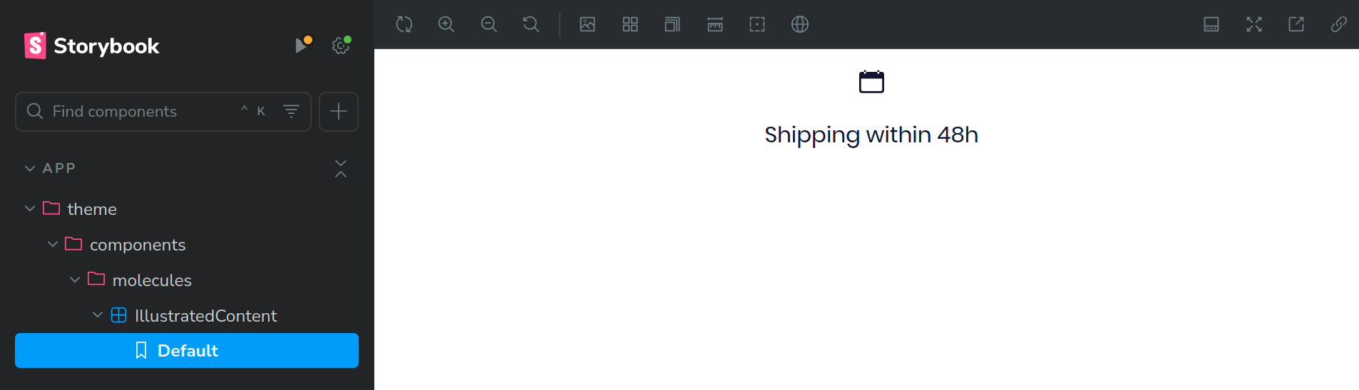
Thanks to this file, when you launch Storybook (pnpm run styleguide), it will
register the stories for the component IllustratedContent. It will make it
accessible in the Storybook's website under app > theme > components >
molecules > IllustratedContent. And if you click on the Default story in
the navigation, it will display a default story which will show the standard
usecase of the IllustratedContent component.
As you might have noticed, once you have added the above IllustratedContent
story, if you edit the story or the component itself, it will update
automatically in Storybook (this feature is called hot reloading). It greatly
improves the experience of authoring UI components.
For now, we've registered only one story for the IllustratedContent. But you
can add more to better explain edge cases of your component. For instance you
could add a story with a very long content or with an <Image /> instead of an
<Icon /> in order to better see how it will behave.
import type { Meta, StoryObj } from "@storybook/react";
import IllustratedContent from "./IllustratedContent";
import Icon from "theme/components/atoms/Icon";
import { H3 } from "theme/components/atoms/Typography/Heading";
import { BodyParagraph } from "theme/components/atoms/Typography/Body";
import Image from "theme/components/atoms/Image";

const meta: Meta<typeof IllustratedContent> = {
  title: "My App/Components/Molecules/IllustratedContent",
  component: IllustratedContent,
};

export default meta;

type Story = StoryObj<typeof IllustratedContent>;

export const Default: Story = {
  render: () => (
    <IllustratedContent media={<Icon title="calendar" icon="calendar-full" />}>
      <H3>Shipping within 48h</H3>
    </IllustratedContent>
  ),
};

export const WithContent: Story = {
  name: "With a lot of content",
  render: () => (
    <IllustratedContent media={<Icon title="calendar" icon="calendar-full" />}>
      <H3>Shipping within 48h</H3>
      <BodyParagraph>
        We are using many delivery services to let you choose what is best for
        you!
      </BodyParagraph>
    </IllustratedContent>
  ),
};

export const WithImage: Story = {
  name: "With an image",
  render: () => (
    <IllustratedContent
      media={<Image src="https://placehold.co/600x400" alt="Placeholder" />}
    >
      <H3>Shipping within 48h</H3>
    </IllustratedContent>
  ),
};

This can be a nice and efficient way to show your designer how the implementation will behave and ask for feedback to improve the User Experience.
You can see that we added a title key in the meta object. This is a way to
organize your stories in Storybook. It will create a new section in the
navigation with the title you provided. In this example, the
IllustratedContent stories will be displayed under My App > Components >
Molecules > IllustratedContent.
We recommend organizing your stories, especially because we will explain something later that will require having an organized structure.
More information about the title key can be found in the
Storybook's documentation.
Add a new usecase to an existing story
There are some cases where the story already exists but you want to add a new edge case. This will usually happen when you override a core component of Front-Commerce and you want to update its story to document the new use case.
In this example, we will consider that you have overridden and updated the
Money
component (as explained in Override a component)
to add a new property hasBorder.
To add this story, you will need to override the Money.stories.tsx in the same
way you overrode the Money.tsx. This means that you should copy the existing
story from
node_modules/@front-commerce/theme-chocolatine/src/theme/components/atoms/Typography/Money/Money.stories.tsx
to app/theme/components/atoms/Typography/Money/Money.stories.tsx.
Once you have copied the file, you need to change the title key in the meta
object. In our example, you can either modify the base title (e.g.,
title: "Components/Atoms/Typography/MoneyOverride",) or change the
organization to fit your application (e.g.,
title: "My App/Components/Atoms/Typography/Money",).
// ... existing code
const meta: Meta<MoneyWithFlatProps> = {
  title: "My App/Components/Atoms/Typography/Money",
  tags: ["autodocs"],
  component: Money,
  // ... existing code
};
Then, you can add override stories to document the new use case. In this
example, we will add the new hasBorder property to the Money component.
// ... existing code
  argTypes: {
    "value.amount": {
      control: "number",
    },
    "value.currency": {
      control: "select",
      options: currenciesAllowedList as any as CurrencyType[],
    },
    hasBorder: {
      control: "boolean",
    },
  },
  args: {
    "value.amount": 19999,
    "value.currency": currenciesAllowedList[0],
    hasBorder: false,
  },
  // ... existing code
Create stories for complex components
This section is currently being migrated.
Display only the relevant stories to your Design System
If you run the styleguide for your own project, you may notice that Front-Commerce comes with a lot of stories. This is what serves as documentation Front-Commerce base theme's core components.
However, you might not use each one of them in your final theme, and some
stories might become irrelevant in your design system. To choose which ones to
display, you need to update the .storybook/main.ts configuration file, and add
the key
stories.
# ...existing code
export default {
-  stories: ["../**/*.stories.@(js|jsx|mjs|ts|tsx)", ...extensionThemeStories],
+  stories: ["../app/**/*.stories.@(js|jsx|mjs|ts|tsx)"],
  addons: [
# ...existing code
  ],
}
This configuration ensures that Storybook does not load unnecessary files, improving performance and organization. Additionally, you can exclude certain folders by adjusting the glob patterns.
Automatic documentation
Storybook provides automatic documentation for your components. It can display description, prop tables, usage examples and interactive controls automatically.
Here is the way to add automatic documentation to your stories based on our
IllustratedContent example:
const meta: Meta<typeof IllustratedContent> = {
  title: "My App/Components/Molecules/IllustratedContent",
  component: IllustratedContent,
  tags: ["autodocs"],
  parameters: {
    docs: {
      description: {
        component: "A component that displays an image or an icon with text.",
      },
    },
  },
};
Since 3.17.0, with Storybook v10, the documentation is automatically generated
for all components. You don't need to add the tags: ["autodocs"] to your
stories anymore.
You can now see the documentation of your component in Storybook:
 *
*
For a more detailed documentation example, you can refer to the
Money
story example.
For further details, please check the official Storybook documentation.